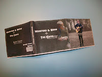
After finishing my digi-pack I thought that it would be best to make a smaller version of what I had designed. This was done so that I could see if anything did not work or if I had placed any images in the wrong place and did not fit the dimensions in the end.
As I did not want to do this wrong I decided to make a tester one. Within this I decided that it was best to keep the outlines on the top. Then I would be able to follow this and see where I was folding, and then what kind of sections they would look like.


As I did not want to do this wrong I decided to make a tester one. Within this I decided that it was best to keep the outlines on the top. Then I would be able to follow this and see where I was folding, and then what kind of sections they would look like.


From doing this I found that it seemed to be quite easy, and decided to go for the final digi-pack. On this I had moved the template to the back so that I could only just see certain lines which I had to follow. With this one it was a lot more tricky to makes sure that I was folding each the sections in the correct place and also making sure everything was even.
In the end I found that it was all fine, and turned out really well. Here are some pictures which I took of the Digi-pack.
Front
In the end I found that it was all fine, and turned out really well. Here are some pictures which I took of the Digi-pack.
Front
Inside
Back
Side panel
I did not realise this when creating the digi-pack that the black writing for our web address was not as clear as I had intended. From seeing this I know now that if I wanted to re-create or edit any of the sections and then re-print and make the digi-pack I would know that I would have to change this to make sure it is readable.
This may of had something to do with the printer that I used as not all of the images were as clear and crisp as I wanted. But they were all still clear.


No comments:
Post a Comment