At the moments myself and Roisin are in the process of editing our evaluation. We both feel that we have got all of the filming which we want. And now have just got the editing to do now. We are not sure how long this is going to take sure. But are very pleased that we have been given two more lessons to work on it. This will be time when we are making sure that we have included everything what we want to and that our video is at the best it could possible be.
Within our evaluation we have decided that we want to include as many of the elements which we have been using within our video into our evaluation. This will then also help show what we have learnt within this process. Within this we have decided to use a number of different effects. Some of these are:
• Layering different images on top of each other – mainly images and screen grabs which we have taken.
• Sections of film layered over the top of us speaking and audience feedback
• Moving images around screen
• Voiceover – this comes through the step by step guide which we have added on areas which we used for this process.
• Speeding up and slowing down clips
• Using live type – this was to give our tittles and extra interest
We hope that all of these will then help us to get the best out of our evaluation, as we are going to be showing all of the skills which both myself and Roisin have gained on working on this video.
Friday, 25 February 2011
Friday, 18 February 2011
Finished video.
This is a copy of our final edited version of our video. Both myself and Roisin we are both very happy with the outcome.
Enjoy :)
Enjoy :)
Digi-pack prototype on finished Digi-pack
After finishing my digi-pack I thought that it would be best to make a smaller version of what I had designed. This was done so that I could see if anything did not work or if I had placed any images in the wrong place and did not fit the dimensions in the end.
As I did not want to do this wrong I decided to make a tester one. Within this I decided that it was best to keep the outlines on the top. Then I would be able to follow this and see where I was folding, and then what kind of sections they would look like.


As I did not want to do this wrong I decided to make a tester one. Within this I decided that it was best to keep the outlines on the top. Then I would be able to follow this and see where I was folding, and then what kind of sections they would look like.


From doing this I found that it seemed to be quite easy, and decided to go for the final digi-pack. On this I had moved the template to the back so that I could only just see certain lines which I had to follow. With this one it was a lot more tricky to makes sure that I was folding each the sections in the correct place and also making sure everything was even.
In the end I found that it was all fine, and turned out really well. Here are some pictures which I took of the Digi-pack.
Front
In the end I found that it was all fine, and turned out really well. Here are some pictures which I took of the Digi-pack.
Front

Inside

Back

Side panel

I did not realise this when creating the digi-pack that the black writing for our web address was not as clear as I had intended. From seeing this I know now that if I wanted to re-create or edit any of the sections and then re-print and make the digi-pack I would know that I would have to change this to make sure it is readable.
This may of had something to do with the printer that I used as not all of the images were as clear and crisp as I wanted. But they were all still clear.
Wednesday, 16 February 2011
Labour Division
During the planning process of designing our music video, we never officially assigned jobs, simply because both of us wanted to do a bit of everything ourselves.
Through the filming of the Auditorium scenes we chose the lighting states together and chose where and how we would set up the camera for different scenes. I enjoyed this personally as it gave me a chance to have some control over the camera action and learn how to work the lighting system, which I had never done before. This was done through the skills which Louis had on working with the lighting desk. This was very helpful as it meant that we were both doing everything and had complete control of what was going on. This also meant that Louis controlled the lights when we needed them. And I had a more control of filming. Until it came to the tracking when we worked together to make sure that the camera stayed still.
Louis – I really enjoyed working in the auditorium as it was our first chance when we got to do what we wanted with the camera. Both myself and Roisin took it in turns working with the camera. But I really enjoyed that fact that I was able to use the lighting desk. And work the lights which we wanted. This was given to me to do as I have had past experience of working with the lights and understand what to do. for the scenes when the lights changed this meant that I was working in the box while Roisin was filming which I did not mind.
When filming the Wood scenes, the filming and directing was split between us, I had alot of fun with the directing however I feel that we should have taken control of the situation more. For example after the filming when it came to the editing we found that there some shots we needed but because we had let the ours actors become so free with their movements we had to work around some mishaps.
Louis – like Roisin I feel that splitting the directing and filming was the best way at the time as it meant that we could get individual style within the piece. There were some shots which we wanted to get but were unable to as our female fell over. And would then not match our continuity. I did not think that this would of effected anything. But wished we could have got some more shows before this. As like Roisin said we were struggling in the editing.
Nonetheless throughout the editing stages of our piece myself and Louis learnt alot about the technologies which we had to use. Final Cut was new to both of us as we had only used iMovie before. Both of us expanded our knowledge and skills, we found these through looking tutorials up on YouTube and trial-and-error in class. For myself personally I found it was more satisfying when we found some effects ourselves as it seemed we had done the job on our own and relied on others. Within the editing Louis did take more of a leadershiop role. This was mainly when it came down to looking at the more complex areas. This was mainly because he had gone off and research how to do these and felt more confident doing this. Throughout the whole process we both made sure that we put as much impute as possible, and thinking about different ideas.
Louis – I feel that I have been able to learn and develop a number of new skills and apply them to other work which I might do. I do not feel that I would of learnt how to do most of this if we had not used final cut, or If I looked into what was what within final cut.
Below is a table of how our "labour" during the whole piece went:


Tuesday, 15 February 2011
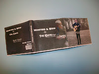
Final digi-pack design
This is my final design which I have come up with for our digi-pack for the song ‘The cave’. I have gone through a number of different photos. And tried them round a number of different ways. In the end I found that this was the best possible result.

There were some areas which I had to change. Like I was unable to include the lyrics onto the digi-pack. This was because it looked messy, and overcrowded which is not what we wanted. For this reason I chose to move this and if I was to make a booklet to go alongside the digi-pack I would have include this in that. Along with other pictures and screen grabs. I would also thin about include pictures of myself and Roisin when we were filming.

1. This is the front cover. On this I have taken an image from the video. And edited it so that the artist has been highlighted and is then at the centre of attention on the front cover. As it is all black. I have chosen to have the writing in white. This is because it helps it to stand out more. This is very simple but I feel is very effect.
2. The back cover. Like the front it is simple again. Again using a screen grab from the video. This time it is of the artist but further away. I have again chosen to highlight the artist so that he is at the centre of attention. I have kept it single with having as little on there as possible only having what is needed.
3. This was added as I feel it was needed. As a lot of cds and placed with the edge facing out and it is important that our audience are able to find the cd in a hurry. Without going through their whole collection.
4. This is the image which is behind the cd. I have chosen to include an image of the guitar as I feel that this is very important, as the song and artist do focus a lot around the guitar. For this I have highlighted the guitar and added more of a golden colour to it, to make it stand out.
5. This is a double panel. Which I originally wanted to include an image and then have the lyrics on. But could not get them to fit and have them at a readable size. Instead I have decided to add the link to our website here. This is so that it is very clear and will catch the eye of our audience. For this I have selected our female and our artist and made them stay the same colour while changing the background to become black and white. This is done to make them standout. I have also made the guitar lighter to help make it stand out more.
6. This was an extra panel which I have chosen to add a single image of the artist playing in our second location. Like the previous image I have selected the artist, and kept him in colour while changing the background into black and white. This was done to help highlight him as the centre point.
This is one of the trials which I had looked with the lyrics. But as it seemed to go on, I found that it was going to look very clumsy if there was too much pushed onto one page, so decided to leave it out.
Over all I feel that this really works. If I had thought out it, I would have chosen to make a booklet to go alongside the digi-pack as it would then have made it possible to add other elements within. This is something which I have learnt from and will remember for future experience.
There were some areas which I had to change. Like I was unable to include the lyrics onto the digi-pack. This was because it looked messy, and overcrowded which is not what we wanted. For this reason I chose to move this and if I was to make a booklet to go alongside the digi-pack I would have include this in that. Along with other pictures and screen grabs. I would also thin about include pictures of myself and Roisin when we were filming.
1. This is the front cover. On this I have taken an image from the video. And edited it so that the artist has been highlighted and is then at the centre of attention on the front cover. As it is all black. I have chosen to have the writing in white. This is because it helps it to stand out more. This is very simple but I feel is very effect.
2. The back cover. Like the front it is simple again. Again using a screen grab from the video. This time it is of the artist but further away. I have again chosen to highlight the artist so that he is at the centre of attention. I have kept it single with having as little on there as possible only having what is needed.
3. This was added as I feel it was needed. As a lot of cds and placed with the edge facing out and it is important that our audience are able to find the cd in a hurry. Without going through their whole collection.
4. This is the image which is behind the cd. I have chosen to include an image of the guitar as I feel that this is very important, as the song and artist do focus a lot around the guitar. For this I have highlighted the guitar and added more of a golden colour to it, to make it stand out.
5. This is a double panel. Which I originally wanted to include an image and then have the lyrics on. But could not get them to fit and have them at a readable size. Instead I have decided to add the link to our website here. This is so that it is very clear and will catch the eye of our audience. For this I have selected our female and our artist and made them stay the same colour while changing the background to become black and white. This is done to make them standout. I have also made the guitar lighter to help make it stand out more.
6. This was an extra panel which I have chosen to add a single image of the artist playing in our second location. Like the previous image I have selected the artist, and kept him in colour while changing the background into black and white. This was done to help highlight him as the centre point.
This is one of the trials which I had looked with the lyrics. But as it seemed to go on, I found that it was going to look very clumsy if there was too much pushed onto one page, so decided to leave it out.
Over all I feel that this really works. If I had thought out it, I would have chosen to make a booklet to go alongside the digi-pack as it would then have made it possible to add other elements within. This is something which I have learnt from and will remember for future experience.
Digi-pack Analysis – Cee Lo Green. The Lady Killer
I have chosen to look at this digi-pack as the bases of it, is based around Cee Lo green. We know this as from on the front cover we are able to see an image of him, which takes up a large percentage of the pack. And we also have his name. Which they helps the audience to clarify who he is. If people are unsure.

I feel that it is very effective having Cee Lo Green on the front of the digi-pack. This is because a couple of reasons. 1. Is because it means that as an audience we are able to see who the artist is. We are also able to gather a kind of style which he may have. This is due to what he is wearing. Also the colours used on to highlight him. As the centre point. 2. It means that the audience may be able to relate his image to a song which they may have heard either on the radio, internet or on a music channel. This is also helped by having his name as a centre point of the front cover, as it means that the audience may be remember some of his work.
These elements must all stand out as it is going to be the front cover of an album which will help to see the single or album if the audience member does not know this person may be or what songs they have released.
This is very similar to the album by Mumford and sons. As they had a huge centre on drawing attention to them and their name. because of this I have chosen to make sure that these are key things which are included on the front cover. I have also thought about using images from the video. This way an audience member might recognise the artist from the video.
The back cover of this album is very simple. With just a simple natural colour, with a list of songs on the album. This is something which must be considered. Is the back going to be very simple or have a number of different elements to it? I feel that keeping it simple works best as it means that an audience member is going to be able to understand and navigate themselves around the digi-pack. It is also important that they are able to see what songs are included on the album. As this is what could see the product.
This is something which I need to make sure I include. And make the back as simple as possible. but still making sure that it is as clear as possible. This will then help to sell the product which is what we want to do.
Monday, 14 February 2011
Digi-pack ideas
In the process of looking at digi-pack designs and examples I have found that the original template which we wanted to use. Was going to be two complex with the time little which we have as we only have got a couple of weeks to make sure that we get this finished. Because of this I have shown to work with a 6 panel digi-pack. This is something which is a lot easier to understand and work on.
In the process of thinking about what I could do with the digi-pack for the single of the cave. I managed to come up with a couple of ideas. These are:
In all of the ideas I have I want to make sure that I try and include the lyrics of the song somewhere within the digi-pack. This is something which I will have to look at and find the best possible place for this. As I am not quite sure what picture and where it will fit best.
Also I want to make sure that I include a link to our website. This is so we can make that link between the three products. It is very important to include this so that our fans would be able to follow Mumford and sons and look out for any latest news.

Having screen grabs of the artist, playing the guitar, mainly taken from sections when are artist is in the auditorium. This will be very simple and have as little as possible on it, keeping it simple but as clear as possible. This runs throughout as all of the other images which would be selected are very simple. Looking at the artist, some with our female character.

This is very similar as before, but just using the screen grabs with the artist where he is in the auditorium. With some of the other shots I am going to look at them and edit them so that the artist in highlighted or the guitar is highlighted so that it stands out. This is because the main focus is based on the artist and guitar.
My final idea is that have a mixture of different screen grabs of both the artist and the female character. And layer them over the top, using different colour films to make different elements stand out. This would be to make sure that we could show as much from the video as possible. making it now to the audience what our video includes.


In the end I have managed to come up with a mixture of my first two ideas. This is because I feel that I can do a lot more and this will be able to show my skills which I have on Photoshop. In this I have chosen a mixture of shots of our artist and female character these are both in the two locations which we filmed. I feel that is going to work the best. But will all come down to trial and error to see what look best.
In the process of thinking about what I could do with the digi-pack for the single of the cave. I managed to come up with a couple of ideas. These are:
In all of the ideas I have I want to make sure that I try and include the lyrics of the song somewhere within the digi-pack. This is something which I will have to look at and find the best possible place for this. As I am not quite sure what picture and where it will fit best.
Also I want to make sure that I include a link to our website. This is so we can make that link between the three products. It is very important to include this so that our fans would be able to follow Mumford and sons and look out for any latest news.
Having screen grabs of the artist, playing the guitar, mainly taken from sections when are artist is in the auditorium. This will be very simple and have as little as possible on it, keeping it simple but as clear as possible. This runs throughout as all of the other images which would be selected are very simple. Looking at the artist, some with our female character.
This is very similar as before, but just using the screen grabs with the artist where he is in the auditorium. With some of the other shots I am going to look at them and edit them so that the artist in highlighted or the guitar is highlighted so that it stands out. This is because the main focus is based on the artist and guitar.
My final idea is that have a mixture of different screen grabs of both the artist and the female character. And layer them over the top, using different colour films to make different elements stand out. This would be to make sure that we could show as much from the video as possible. making it now to the audience what our video includes.
In the end I have managed to come up with a mixture of my first two ideas. This is because I feel that I can do a lot more and this will be able to show my skills which I have on Photoshop. In this I have chosen a mixture of shots of our artist and female character these are both in the two locations which we filmed. I feel that is going to work the best. But will all come down to trial and error to see what look best.
Audience feedback on Finished video
Now that we have finished our video. And to go along with our evaluation we have got together a group of male and female students who all fit within our target audience which we have been planning to aim our video at.
We have chosen to film our audience feedback. This way it will become easier to adding into to our evaluation. It will also help us to use a multiple styles of media context within our evaluation to make it as interesting as possible.
Within this we chose to ask a number of different questions. These questions where made to help us get as much positive feedback. And also help to try and gain some constructive criticism as well. This would help us to then maybe work on our video for the final deadline. Making it the best it could possibly be.
Some of our group which we asked to help us with the audience feedback, had seen parts of the video and had been giving us different points for us to work on, and make our video the best it could possibly be. The group watching had all seen different versions. And elements had changed from when they had all watched it last.
Below is the questions which we asked our audience:
1. How smooth was the editing? E.g. transitions cut on beat, lip syncing.
2. What did you think of the video?
3. What did you think of the effects used in the video? Did they work within the context? Was there any effects that did not work?
4. What did you think of the casting? Did they people we chose fit the roles?
5. Was there anything that you did not like? Or would change?
6. Did you understand the narrative?
7. Other comments
I found that these selections gave us enough feedback to help us with our evaluation. We have also decided that from this there is not really anything that we now want to change within our video. And we are both 100% happy with the outcome of it.
Sunday, 6 February 2011
Video analysis - The white strips – The hardest button to button.
Within this video i have been looking at the different editing styles which Gondry has added to this video to help give it that unique touch. From this we have thought about what we could do to our video to help make it have a different edge to it, which is just not the normal straight cut which we normal use. Hopefully this will give us some ideas about what we could possible do.
This video is both performance and concept base. We can see this as we have the two members being shown throughout the whole video. But then it has got the different elements which then make it a concept video and give it that Gondry style to it.
A common thing throughout is the use of rough cuts, this is due to the way that they use visual echoes for the instruments, this is shown by having the two move on to a new instrument in a different position, normal leading in a path or travelling in a certain direction. But through this we still have the old instrument in its place. This has been done by a mixture of real instruments and edits to help create a larger number of instruments. This works very well and shows the clear link between music and visuals from Goodwin’s 6. This process is also helped by the way in which the volume of instruments included grows along with the music. Creating more and more and using a number of different effects and creating different patterns. These are all different and unique as they all are slightly different. This is due to the lighting and background movement, as in some shots it would be lighter and other darker. We also see a one point a car appear and then disappear straight away. This is something which comes with the rough cuts and the way which this was created. All together it works very well and has a stylized feel to it.
Something which helps to show the link between music and visuals is the way which each time the instruments move we can see how they are cut on the beat. Giving it that faster pace and also helping to show the link which it has. This becomes a lot clearer as we go through the speed of the piece changes. And we then see that the movement speeds up and slows down. Giving it different dynamics to different sections and different instruments. Giving it again a unique touch.
This idea of having different instruments appear and move on to different points and showing the travelling. Is something which we would like to include in our video. We know that we would not be able to do it to the extent which Gondry has used within the video. We have decided to take the idea of having a person appear in different points of the screen and perform something at the same time. When the character comes into the shot, we will use cut on the beat to revile her. This will hopeful then show a link between the music and the visuals within our video. Which we want to include.
We have seen this in previous student work. And have been working on a way in which we could do this in our video. We have tried a couple of practices, but found that it has been a struggle to get this looking its best.
Now having finished our video I feel that we have managed to do this, and hope that it has been as effective as we want it to be. I feel that we need to look back at this and make sure that it is looking its best, and looks like one image and not a number of different clips put together in a rush.
Directors study – Michel Gondry
Michel Gondry was born on the 8th May 1963; he was born in Versailles, France. He is the grandson of the inventor Constant Martin. Constant martin was a French engineer and inventor who perfected a successfully commercialised different radio sets, these were most famously known as the Clavioline. Michel’s filmmaking career started when he was creating music videos for the French rock band call Oui Oui, where he was also the drummer for the band. From these videos Michel was approached to do other music videos for French bands, from there on he went on to work with a number of different artists some of these include are
• Daft punk
• The White Strips
• The Chemical Brothers
• The Vines
• Steriogram
• Radiohead
• Rolling stone
• BjÖrk
Instead of Gondry approaching different bands, the bands would have approached Gondry and asked him to create a video for them. This would have been for his unique style which he has.
Not only working for artists to create their music video he also created a numerous television commercials, one of these was the “bullet time” (advert – 1998) which was said to of had the technique later adapted in The Matrix.
In Eternal sunshine which was released in 2004, you are able to see how Michel Gondry has used a number of his image manipulation techniques which were experimented throughout his use of creating music videos. Michel Gondry also won an Academy Award alongside Kaufman and Pierre Bismuth, this was all for the screenplay of Eternal Sunshine.
The style of Michel Gondry’s music videos are often relies on videography and camera tricks which play with frames of reference.
He also uses digital manipulation changing certain areas to create the best effect possible. This would have all been done during the post-production stages. This is where we would be able to apply some of his unique touch which you can see in all of his videos.
He also uses theatrical elements within these videos. These include props, costumes, sets etc.
We can see a lot of these elements within his video for the white strips “the hardest button to button.”
Digi-pack images
Within our digi-pack and website we both had decided that we wanted to use some of the stills from our music video, and these then would help to see the artists single.
Now that we have finished our video I have gone through and taken a number of different screens grabs of our video. I have taken a number of different images of the artist as well as some of our female/dancer. Hopefully I will be able to use these throughout the digi-pack.
With the images which we have chosen to use, we will then have to work with using Photoshop to edit the pictures to make sure that they are all fitting in within our digi-pack and on our website. This would then make the whole thing have a constant theme and link throughout.
While looking at the screen grabs I have been playing around on Photoshop, which what I could possible to help enhance the pictures and make them the best thing which we could possible get. One thing which I have been looking at is adding highlights to certain parts of the image as if it has been placed in a spot light

I think that this works really well as it then helps to focus on that part of the screen and what is going on, even though it is a very small image of the artist. I will also look about applying this to the front cover image so that it has a constant link between them all. It could also help on the cd or in other sections of the digi-pack. This will have to come through a trial and error process.
Another thing which I have been looking at is what I can do with the title and making the most of this. This is because it will be one of the first things that the audience see.

For this I have looked at adding a second layer to the text giving it a red highlight around the edge. This then brings the text forward and makes it bolder. I am not sure if this is going to work and will link into piece of the website and will have to check with rosin. I chose to add red as within a lot of the dance sequences we have got a red light on the back of the images. I felt that this would then have a link and a purpose for using it.
These will all most probably change as I carry on playing around with what I could do on Photoshop and what is going to work for our digi-pack. This will also depend on what images I chose to look at. And what images and screen grabs I chose to use.
Now that we have finished our video I have gone through and taken a number of different screens grabs of our video. I have taken a number of different images of the artist as well as some of our female/dancer. Hopefully I will be able to use these throughout the digi-pack.
With the images which we have chosen to use, we will then have to work with using Photoshop to edit the pictures to make sure that they are all fitting in within our digi-pack and on our website. This would then make the whole thing have a constant theme and link throughout.
While looking at the screen grabs I have been playing around on Photoshop, which what I could possible to help enhance the pictures and make them the best thing which we could possible get. One thing which I have been looking at is adding highlights to certain parts of the image as if it has been placed in a spot light
I think that this works really well as it then helps to focus on that part of the screen and what is going on, even though it is a very small image of the artist. I will also look about applying this to the front cover image so that it has a constant link between them all. It could also help on the cd or in other sections of the digi-pack. This will have to come through a trial and error process.
Another thing which I have been looking at is what I can do with the title and making the most of this. This is because it will be one of the first things that the audience see.
For this I have looked at adding a second layer to the text giving it a red highlight around the edge. This then brings the text forward and makes it bolder. I am not sure if this is going to work and will link into piece of the website and will have to check with rosin. I chose to add red as within a lot of the dance sequences we have got a red light on the back of the images. I felt that this would then have a link and a purpose for using it.
These will all most probably change as I carry on playing around with what I could do on Photoshop and what is going to work for our digi-pack. This will also depend on what images I chose to look at. And what images and screen grabs I chose to use.
Finished Editing.
Over the past couple of weeks both myself and Roisin have been working very hard to make sure that our video was finished by the deadline of Friday 4th February. We were lucky enough to be able to come in during our free periods to make sure that we got the video completed.
With our first draft of our video, both myself and Roisin are very pleased with what we have come up with. There have been a number of different clips which we have spent a lot of time worrying about as they did not seem to fit in. but once going through and sorting these out. We both feel that we have got the best out of what we both could do.
This process we very challenging as we had different ideas about parts of the video which we had to work through and make sure that we were both happy with what we were working with. In the end I have found that we have managed to include a number of different sections which we had both thought of throughout, which complement each other throughout.
After watching back the video I have been able to see a couple of points which we need to work on and make sure that these are corrected before we forget. Otherwise we will have a final video done. We also have decided to make sure that we get as much audience feedback as possible so we can see what our target audience feel. This should then help us to see if anything drastic sticks out for them and needs to be changed while we still have time.
Over the next couple of days we are going to be grabbing as many people as possible and showing them the video to see what they think. hopeful this will then help with how we could improve our video to the best possible slandered. During the process we looked at doing this with a couple of people and found that this helped a lot. As we found areas which we had not really looked at as much. The audience feedback then brought this to our attention, helping us to improve different sections.
Wednesday, 2 February 2011
Previous Student Work - Sweet Disposition (James Madison University)
This video caught my interest as many of the elements of Goodwin's 6, which we had discussed alot in class, had been avoided. The video was completely narrative based. There was no sign of any members of the band or even any references to music, appart from when the blonde girl is listening to her CD player, though it is not made clear if she is listening to the song presently beginning or another song entirely. A record label would not have agreed with this look as it does not sell the band or their image. It is something different which artist personally may have gone for but not those representing them.
There are some interesting effects used such as the split screen which ties the beginning and end together, leading the audience to believe the couple will make it back together, only to be disappointed. Though itis an interesting effect, myself and Louis have not used it in our own piece as we feel it does not fit anywhere, since most of the effects we have used have some metaphor with them or they link with the lyrics on some level.
Furthermore the students editing skills have been shown to a great effect, the video flows well from one shot to another. This something Louis and I hope to achieve in our own work. One particular moment which caught my eye was when the male character faded from the bed. This is something me and Louis were hoping to use, it seems to be a clear motif for when couples are breaking up or one has left the other. Unfortunately circumstances have led us to feel we may not be able to achieve this. Yet these students have shown it can be done, and to great effect.
Photo-Shoot for the Website
For the final stages of our video I felt that we needed to have a variety of shots included in our video, so using my own knowledge of photography me and Louis agreed to shoot Jazz in a different andmore controlled enviroment to give a proffessional look to the website. We would also use screen-grabs from the video as another source for images.
For this part of project I took personal interest an researched some positions which Jazz might like to use. I felt that his guitar was a key piece for this so we used it as prop, plus with the guitar in his hands Jazz seemed to relax more and it was easier for me to get the shots i was looking for.
However to add something abit different we also did shots without his guitar to create variety. I also chose to use a high angle for his face, as this helped the light shine into his eyes making them more clear and pulled back the skin along his cheeks and nech giving him more definition.
Back at school I used Photoshop to edit and create different styles with the photos, with this I was able to expand my knowledge and use of the tool. Personally I liked the back-and-white pictures better as I feel they look more proffessional and clean-cut. Whereas though the colour ones were fun to do, I feel they look amateur and could be much improved.
Trailing & Layering In Video
To add something special to our video, myself and Louis have decided to use special effects to give our video a more polished and proffessional look. We felt that during her dancing Daisy's character should have something added to her, since at that point in the narrative she wasn't sure of herself. We found an effect called "Trailing" which created the effect shown below:
As well as this during the scene in which the male character looks at a photo of him and the female character, we layered another image of the two laughing on top, this was to show how their relationship had once been good.
Orginally in this scene we wanted to have the couple together and for the male to faid from the screen to show the group growing apart. However due to time issues and other personal difficulties this unfortunatly was not possible. Nonetheless the scene works with the male character as we had only scene him shortly before some this creates a story for him and developes the audiences understanding that the couple are breaking up, and the female character has found someone else in the artist.
Subscribe to:
Posts (Atom)