At the moments myself and Roisin are in the process of editing our evaluation. We both feel that we have got all of the filming which we want. And now have just got the editing to do now. We are not sure how long this is going to take sure. But are very pleased that we have been given two more lessons to work on it. This will be time when we are making sure that we have included everything what we want to and that our video is at the best it could possible be.
Within our evaluation we have decided that we want to include as many of the elements which we have been using within our video into our evaluation. This will then also help show what we have learnt within this process. Within this we have decided to use a number of different effects. Some of these are:
• Layering different images on top of each other – mainly images and screen grabs which we have taken.
• Sections of film layered over the top of us speaking and audience feedback
• Moving images around screen
• Voiceover – this comes through the step by step guide which we have added on areas which we used for this process.
• Speeding up and slowing down clips
• Using live type – this was to give our tittles and extra interest
We hope that all of these will then help us to get the best out of our evaluation, as we are going to be showing all of the skills which both myself and Roisin have gained on working on this video.
Friday, 25 February 2011

Friday, 18 February 2011
Finished video.
This is a copy of our final edited version of our video. Both myself and Roisin we are both very happy with the outcome.
Enjoy :)
Enjoy :)
Digi-pack prototype on finished Digi-pack
After finishing my digi-pack I thought that it would be best to make a smaller version of what I had designed. This was done so that I could see if anything did not work or if I had placed any images in the wrong place and did not fit the dimensions in the end.
As I did not want to do this wrong I decided to make a tester one. Within this I decided that it was best to keep the outlines on the top. Then I would be able to follow this and see where I was folding, and then what kind of sections they would look like.
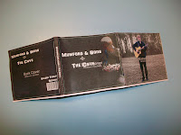


As I did not want to do this wrong I decided to make a tester one. Within this I decided that it was best to keep the outlines on the top. Then I would be able to follow this and see where I was folding, and then what kind of sections they would look like.


From doing this I found that it seemed to be quite easy, and decided to go for the final digi-pack. On this I had moved the template to the back so that I could only just see certain lines which I had to follow. With this one it was a lot more tricky to makes sure that I was folding each the sections in the correct place and also making sure everything was even.
In the end I found that it was all fine, and turned out really well. Here are some pictures which I took of the Digi-pack.
Front
In the end I found that it was all fine, and turned out really well. Here are some pictures which I took of the Digi-pack.
Front

Inside

Back

Side panel

I did not realise this when creating the digi-pack that the black writing for our web address was not as clear as I had intended. From seeing this I know now that if I wanted to re-create or edit any of the sections and then re-print and make the digi-pack I would know that I would have to change this to make sure it is readable.
This may of had something to do with the printer that I used as not all of the images were as clear and crisp as I wanted. But they were all still clear.
Wednesday, 16 February 2011
Labour Division
During the planning process of designing our music video, we never officially assigned jobs, simply because both of us wanted to do a bit of everything ourselves.
Through the filming of the Auditorium scenes we chose the lighting states together and chose where and how we would set up the camera for different scenes. I enjoyed this personally as it gave me a chance to have some control over the camera action and learn how to work the lighting system, which I had never done before. This was done through the skills which Louis had on working with the lighting desk. This was very helpful as it meant that we were both doing everything and had complete control of what was going on. This also meant that Louis controlled the lights when we needed them. And I had a more control of filming. Until it came to the tracking when we worked together to make sure that the camera stayed still.
Louis – I really enjoyed working in the auditorium as it was our first chance when we got to do what we wanted with the camera. Both myself and Roisin took it in turns working with the camera. But I really enjoyed that fact that I was able to use the lighting desk. And work the lights which we wanted. This was given to me to do as I have had past experience of working with the lights and understand what to do. for the scenes when the lights changed this meant that I was working in the box while Roisin was filming which I did not mind.
When filming the Wood scenes, the filming and directing was split between us, I had alot of fun with the directing however I feel that we should have taken control of the situation more. For example after the filming when it came to the editing we found that there some shots we needed but because we had let the ours actors become so free with their movements we had to work around some mishaps.
Louis – like Roisin I feel that splitting the directing and filming was the best way at the time as it meant that we could get individual style within the piece. There were some shots which we wanted to get but were unable to as our female fell over. And would then not match our continuity. I did not think that this would of effected anything. But wished we could have got some more shows before this. As like Roisin said we were struggling in the editing.
Nonetheless throughout the editing stages of our piece myself and Louis learnt alot about the technologies which we had to use. Final Cut was new to both of us as we had only used iMovie before. Both of us expanded our knowledge and skills, we found these through looking tutorials up on YouTube and trial-and-error in class. For myself personally I found it was more satisfying when we found some effects ourselves as it seemed we had done the job on our own and relied on others. Within the editing Louis did take more of a leadershiop role. This was mainly when it came down to looking at the more complex areas. This was mainly because he had gone off and research how to do these and felt more confident doing this. Throughout the whole process we both made sure that we put as much impute as possible, and thinking about different ideas.
Louis – I feel that I have been able to learn and develop a number of new skills and apply them to other work which I might do. I do not feel that I would of learnt how to do most of this if we had not used final cut, or If I looked into what was what within final cut.
Below is a table of how our "labour" during the whole piece went:
Through the filming of the Auditorium scenes we chose the lighting states together and chose where and how we would set up the camera for different scenes. I enjoyed this personally as it gave me a chance to have some control over the camera action and learn how to work the lighting system, which I had never done before. This was done through the skills which Louis had on working with the lighting desk. This was very helpful as it meant that we were both doing everything and had complete control of what was going on. This also meant that Louis controlled the lights when we needed them. And I had a more control of filming. Until it came to the tracking when we worked together to make sure that the camera stayed still.
Louis – I really enjoyed working in the auditorium as it was our first chance when we got to do what we wanted with the camera. Both myself and Roisin took it in turns working with the camera. But I really enjoyed that fact that I was able to use the lighting desk. And work the lights which we wanted. This was given to me to do as I have had past experience of working with the lights and understand what to do. for the scenes when the lights changed this meant that I was working in the box while Roisin was filming which I did not mind.
When filming the Wood scenes, the filming and directing was split between us, I had alot of fun with the directing however I feel that we should have taken control of the situation more. For example after the filming when it came to the editing we found that there some shots we needed but because we had let the ours actors become so free with their movements we had to work around some mishaps.
Louis – like Roisin I feel that splitting the directing and filming was the best way at the time as it meant that we could get individual style within the piece. There were some shots which we wanted to get but were unable to as our female fell over. And would then not match our continuity. I did not think that this would of effected anything. But wished we could have got some more shows before this. As like Roisin said we were struggling in the editing.
Nonetheless throughout the editing stages of our piece myself and Louis learnt alot about the technologies which we had to use. Final Cut was new to both of us as we had only used iMovie before. Both of us expanded our knowledge and skills, we found these through looking tutorials up on YouTube and trial-and-error in class. For myself personally I found it was more satisfying when we found some effects ourselves as it seemed we had done the job on our own and relied on others. Within the editing Louis did take more of a leadershiop role. This was mainly when it came down to looking at the more complex areas. This was mainly because he had gone off and research how to do these and felt more confident doing this. Throughout the whole process we both made sure that we put as much impute as possible, and thinking about different ideas.
Louis – I feel that I have been able to learn and develop a number of new skills and apply them to other work which I might do. I do not feel that I would of learnt how to do most of this if we had not used final cut, or If I looked into what was what within final cut.
Below is a table of how our "labour" during the whole piece went:


Tuesday, 15 February 2011
Final digi-pack design
This is my final design which I have come up with for our digi-pack for the song ‘The cave’. I have gone through a number of different photos. And tried them round a number of different ways. In the end I found that this was the best possible result.

There were some areas which I had to change. Like I was unable to include the lyrics onto the digi-pack. This was because it looked messy, and overcrowded which is not what we wanted. For this reason I chose to move this and if I was to make a booklet to go alongside the digi-pack I would have include this in that. Along with other pictures and screen grabs. I would also thin about include pictures of myself and Roisin when we were filming.

1. This is the front cover. On this I have taken an image from the video. And edited it so that the artist has been highlighted and is then at the centre of attention on the front cover. As it is all black. I have chosen to have the writing in white. This is because it helps it to stand out more. This is very simple but I feel is very effect.
2. The back cover. Like the front it is simple again. Again using a screen grab from the video. This time it is of the artist but further away. I have again chosen to highlight the artist so that he is at the centre of attention. I have kept it single with having as little on there as possible only having what is needed.
3. This was added as I feel it was needed. As a lot of cds and placed with the edge facing out and it is important that our audience are able to find the cd in a hurry. Without going through their whole collection.
4. This is the image which is behind the cd. I have chosen to include an image of the guitar as I feel that this is very important, as the song and artist do focus a lot around the guitar. For this I have highlighted the guitar and added more of a golden colour to it, to make it stand out.
5. This is a double panel. Which I originally wanted to include an image and then have the lyrics on. But could not get them to fit and have them at a readable size. Instead I have decided to add the link to our website here. This is so that it is very clear and will catch the eye of our audience. For this I have selected our female and our artist and made them stay the same colour while changing the background to become black and white. This is done to make them standout. I have also made the guitar lighter to help make it stand out more.
6. This was an extra panel which I have chosen to add a single image of the artist playing in our second location. Like the previous image I have selected the artist, and kept him in colour while changing the background into black and white. This was done to help highlight him as the centre point.
This is one of the trials which I had looked with the lyrics. But as it seemed to go on, I found that it was going to look very clumsy if there was too much pushed onto one page, so decided to leave it out.
Over all I feel that this really works. If I had thought out it, I would have chosen to make a booklet to go alongside the digi-pack as it would then have made it possible to add other elements within. This is something which I have learnt from and will remember for future experience.
There were some areas which I had to change. Like I was unable to include the lyrics onto the digi-pack. This was because it looked messy, and overcrowded which is not what we wanted. For this reason I chose to move this and if I was to make a booklet to go alongside the digi-pack I would have include this in that. Along with other pictures and screen grabs. I would also thin about include pictures of myself and Roisin when we were filming.
1. This is the front cover. On this I have taken an image from the video. And edited it so that the artist has been highlighted and is then at the centre of attention on the front cover. As it is all black. I have chosen to have the writing in white. This is because it helps it to stand out more. This is very simple but I feel is very effect.
2. The back cover. Like the front it is simple again. Again using a screen grab from the video. This time it is of the artist but further away. I have again chosen to highlight the artist so that he is at the centre of attention. I have kept it single with having as little on there as possible only having what is needed.
3. This was added as I feel it was needed. As a lot of cds and placed with the edge facing out and it is important that our audience are able to find the cd in a hurry. Without going through their whole collection.
4. This is the image which is behind the cd. I have chosen to include an image of the guitar as I feel that this is very important, as the song and artist do focus a lot around the guitar. For this I have highlighted the guitar and added more of a golden colour to it, to make it stand out.
5. This is a double panel. Which I originally wanted to include an image and then have the lyrics on. But could not get them to fit and have them at a readable size. Instead I have decided to add the link to our website here. This is so that it is very clear and will catch the eye of our audience. For this I have selected our female and our artist and made them stay the same colour while changing the background to become black and white. This is done to make them standout. I have also made the guitar lighter to help make it stand out more.
6. This was an extra panel which I have chosen to add a single image of the artist playing in our second location. Like the previous image I have selected the artist, and kept him in colour while changing the background into black and white. This was done to help highlight him as the centre point.
This is one of the trials which I had looked with the lyrics. But as it seemed to go on, I found that it was going to look very clumsy if there was too much pushed onto one page, so decided to leave it out.
Over all I feel that this really works. If I had thought out it, I would have chosen to make a booklet to go alongside the digi-pack as it would then have made it possible to add other elements within. This is something which I have learnt from and will remember for future experience.
Digi-pack Analysis – Cee Lo Green. The Lady Killer
I have chosen to look at this digi-pack as the bases of it, is based around Cee Lo green. We know this as from on the front cover we are able to see an image of him, which takes up a large percentage of the pack. And we also have his name. Which they helps the audience to clarify who he is. If people are unsure.

I feel that it is very effective having Cee Lo Green on the front of the digi-pack. This is because a couple of reasons. 1. Is because it means that as an audience we are able to see who the artist is. We are also able to gather a kind of style which he may have. This is due to what he is wearing. Also the colours used on to highlight him. As the centre point. 2. It means that the audience may be able to relate his image to a song which they may have heard either on the radio, internet or on a music channel. This is also helped by having his name as a centre point of the front cover, as it means that the audience may be remember some of his work.
These elements must all stand out as it is going to be the front cover of an album which will help to see the single or album if the audience member does not know this person may be or what songs they have released.
This is very similar to the album by Mumford and sons. As they had a huge centre on drawing attention to them and their name. because of this I have chosen to make sure that these are key things which are included on the front cover. I have also thought about using images from the video. This way an audience member might recognise the artist from the video.
The back cover of this album is very simple. With just a simple natural colour, with a list of songs on the album. This is something which must be considered. Is the back going to be very simple or have a number of different elements to it? I feel that keeping it simple works best as it means that an audience member is going to be able to understand and navigate themselves around the digi-pack. It is also important that they are able to see what songs are included on the album. As this is what could see the product.
This is something which I need to make sure I include. And make the back as simple as possible. but still making sure that it is as clear as possible. This will then help to sell the product which is what we want to do.
Monday, 14 February 2011
Digi-pack ideas
In the process of looking at digi-pack designs and examples I have found that the original template which we wanted to use. Was going to be two complex with the time little which we have as we only have got a couple of weeks to make sure that we get this finished. Because of this I have shown to work with a 6 panel digi-pack. This is something which is a lot easier to understand and work on.
In the process of thinking about what I could do with the digi-pack for the single of the cave. I managed to come up with a couple of ideas. These are:
In all of the ideas I have I want to make sure that I try and include the lyrics of the song somewhere within the digi-pack. This is something which I will have to look at and find the best possible place for this. As I am not quite sure what picture and where it will fit best.
Also I want to make sure that I include a link to our website. This is so we can make that link between the three products. It is very important to include this so that our fans would be able to follow Mumford and sons and look out for any latest news.

Having screen grabs of the artist, playing the guitar, mainly taken from sections when are artist is in the auditorium. This will be very simple and have as little as possible on it, keeping it simple but as clear as possible. This runs throughout as all of the other images which would be selected are very simple. Looking at the artist, some with our female character.

This is very similar as before, but just using the screen grabs with the artist where he is in the auditorium. With some of the other shots I am going to look at them and edit them so that the artist in highlighted or the guitar is highlighted so that it stands out. This is because the main focus is based on the artist and guitar.
My final idea is that have a mixture of different screen grabs of both the artist and the female character. And layer them over the top, using different colour films to make different elements stand out. This would be to make sure that we could show as much from the video as possible. making it now to the audience what our video includes.


In the end I have managed to come up with a mixture of my first two ideas. This is because I feel that I can do a lot more and this will be able to show my skills which I have on Photoshop. In this I have chosen a mixture of shots of our artist and female character these are both in the two locations which we filmed. I feel that is going to work the best. But will all come down to trial and error to see what look best.
In the process of thinking about what I could do with the digi-pack for the single of the cave. I managed to come up with a couple of ideas. These are:
In all of the ideas I have I want to make sure that I try and include the lyrics of the song somewhere within the digi-pack. This is something which I will have to look at and find the best possible place for this. As I am not quite sure what picture and where it will fit best.
Also I want to make sure that I include a link to our website. This is so we can make that link between the three products. It is very important to include this so that our fans would be able to follow Mumford and sons and look out for any latest news.
Having screen grabs of the artist, playing the guitar, mainly taken from sections when are artist is in the auditorium. This will be very simple and have as little as possible on it, keeping it simple but as clear as possible. This runs throughout as all of the other images which would be selected are very simple. Looking at the artist, some with our female character.
This is very similar as before, but just using the screen grabs with the artist where he is in the auditorium. With some of the other shots I am going to look at them and edit them so that the artist in highlighted or the guitar is highlighted so that it stands out. This is because the main focus is based on the artist and guitar.
My final idea is that have a mixture of different screen grabs of both the artist and the female character. And layer them over the top, using different colour films to make different elements stand out. This would be to make sure that we could show as much from the video as possible. making it now to the audience what our video includes.
In the end I have managed to come up with a mixture of my first two ideas. This is because I feel that I can do a lot more and this will be able to show my skills which I have on Photoshop. In this I have chosen a mixture of shots of our artist and female character these are both in the two locations which we filmed. I feel that is going to work the best. But will all come down to trial and error to see what look best.
Subscribe to:
Posts (Atom)