Record Company

Produced by Louis Perry (0254) & Roisin Evans (0107)

Friday, 4 March 2011

Evaluation

This is our finished evaluation from our music video.


http://www.youtube.com/watch?v=uTbp-4q6eqw&feature=related

Within this we have answered the questions:

1. In what ways does your media product use, develop or challenge forms and conventions of real media products?
2. How effective is the combination of your main product and ancillary texts?
3. What have you learned from your audience feedback?
4. How did you use media technologies in the construction and research, planning and evaluation stages?


In the end we were both happy with our evaluation. And feel that we have shown everything which we have learnt within this project.

Link to Website

www.wix.com/goldentongue/mumfordandsons

Video Posts

To create the best chance of getting the most comments we could on the video, we have placed the video on this blog, our website, YouTube and Facebook. Because of this we have receieved lots of comments from friends and fans. Which we have taken in to account for our evaluation, some have been simple compliments though we have also recieved interesting feedback from other media students and encouragment from our teachers.

Website Changes

Atfer looking at other student Website designs I felt that I had not designed the site to a high enough standard. With this in mind I did some more research into other student work and looked at more tutorials through YouTube into the workings of Wix. I also asked some members of the Hopeful Youths catagory what they thought of the site. Many commented that the picture as a background was good but it was distracting when on the Photos page. I also found that many websites have symbols for the band, and I remembered that Louis had used a embelem on the digi-pak. I decided to use this as the main focus rather than the picture. This gave a the site a much simpler and effectice look, making it easier for the fans to focus on the important details we had created and it was easier for them to navagate around the site.

Friday, 25 February 2011

Evaluation so far

At the moments myself and Roisin are in the process of editing our evaluation. We both feel that we have got all of the filming which we want. And now have just got the editing to do now. We are not sure how long this is going to take sure. But are very pleased that we have been given two more lessons to work on it. This will be time when we are making sure that we have included everything what we want to and that our video is at the best it could possible be.

Within our evaluation we have decided that we want to include as many of the elements which we have been using within our video into our evaluation. This will then also help show what we have learnt within this process. Within this we have decided to use a number of different effects. Some of these are:
• Layering different images on top of each other – mainly images and screen grabs which we have taken.
• Sections of film layered over the top of us speaking and audience feedback
• Moving images around screen
• Voiceover – this comes through the step by step guide which we have added on areas which we used for this process.
• Speeding up and slowing down clips
• Using live type – this was to give our tittles and extra interest
We hope that all of these will then help us to get the best out of our evaluation, as we are going to be showing all of the skills which both myself and Roisin have gained on working on this video.
Friday, 18 February 2011

Finished video.

This is a copy of our final edited version of our video. Both myself and Roisin we are both very happy with the outcome.

Enjoy :)


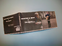
Digi-pack prototype on finished Digi-pack

After finishing my digi-pack I thought that it would be best to make a smaller version of what I had designed. This was done so that I could see if anything did not work or if I had placed any images in the wrong place and did not fit the dimensions in the end.

As I did not want to do this wrong I decided to make a tester one. Within this I decided that it was best to keep the outlines on the top. Then I would be able to follow this and see where I was folding, and then what kind of sections they would look like.


From doing this I found that it seemed to be quite easy, and decided to go for the final digi-pack. On this I had moved the template to the back so that I could only just see certain lines which I had to follow. With this one it was a lot more tricky to makes sure that I was folding each the sections in the correct place and also making sure everything was even.

In the end I found that it was all fine, and turned out really well. Here are some pictures which I took of the Digi-pack.

Front

Inside


Back


Side panel


I did not realise this when creating the digi-pack that the black writing for our web address was not as clear as I had intended. From seeing this I know now that if I wanted to re-create or edit any of the sections and then re-print and make the digi-pack I would know that I would have to change this to make sure it is readable.
This may of had something to do with the printer that I used as not all of the images were as clear and crisp as I wanted. But they were all still clear.